This post showcases a Data Visualization Team Project for the Introduction to Industrial Engineering course at the University of Arkansas. Using Major League Baseball data from the 2024 season, our team explored several analytical questions related to player performance and pitch effectiveness. The website Baseball Savant contains a wealth of data regarding Major League Baseball (MLB) players, many of which is collected using proprietary technology owned and operated by MLB itself. Baseball Savant also allows users to download large data sets for their own personal use. This is where we got our data, compiling a file of every MLB pitcher to throw at least 50 pitches in a given month in the 2024 MLB season. The slides below represent the questions we asked, the reasoning behind them, and how we used Excel to analyze and visualize the answers.
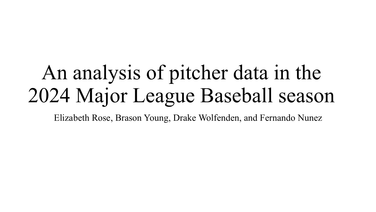
I examined the relationship between fastball velocity and arm angle. If there is any notable correlation, a player who wants to throw harder can work on raising or lowering their arm angle in order to reach their goal. To answer this question, I created a pivot table in excel that included all 720 pitchers in the 2024 MLB season to throw at least 50 pitches in a month. I included player name as a row label and average 4-seam fastball velocity and average arm angle on 4 seam fastball pitches as values. From there, I excluded submarine pitchers with a negative arm angle, as they are bio mechanical outlines, making up less than 1% of the data set. Finally, I created a scatter plot to graph the correlation between arm angle and velocity.
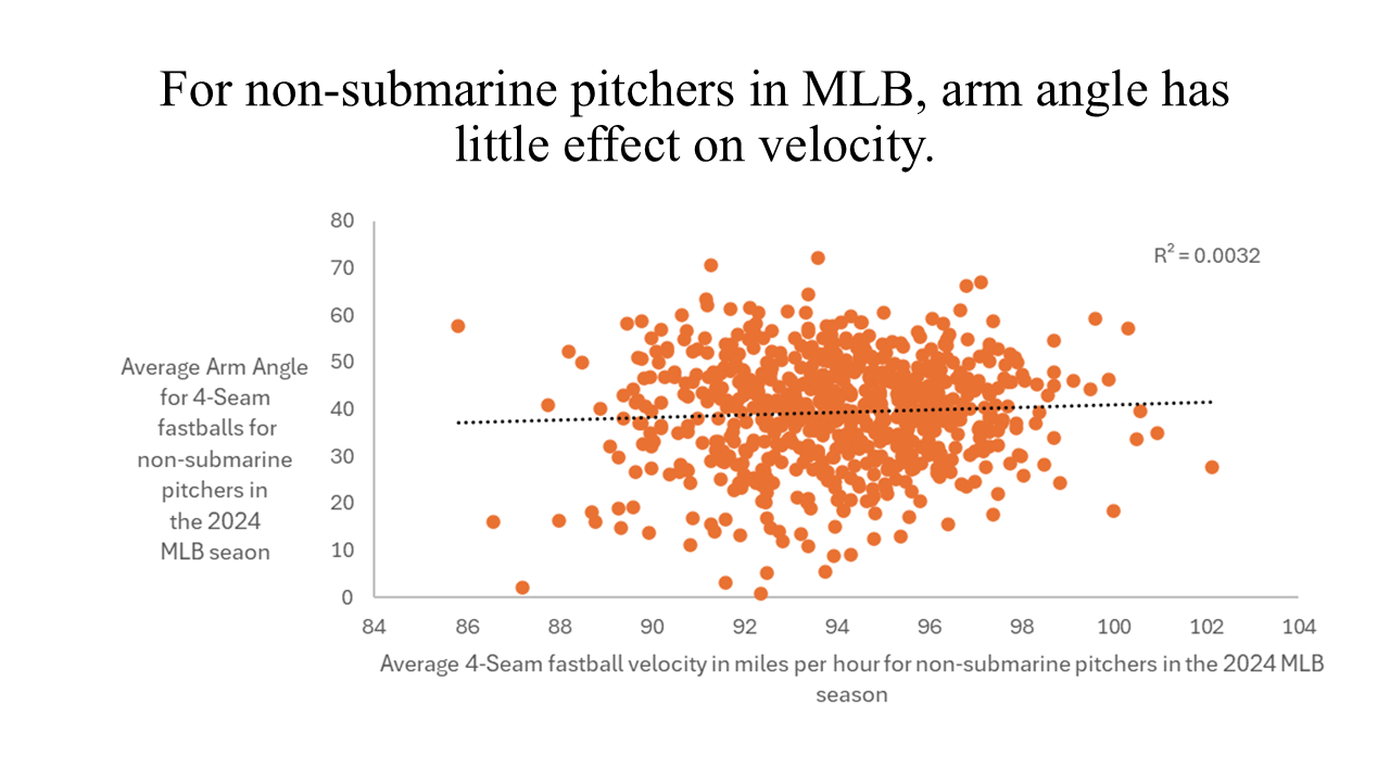
This question is interesting because it explores how player performance evolves over time. By analyzing month-to-month trends in batting average, we can see whether players improve with more at-bats or decline due to fatigue. We used Excel to group the data by month, then calculated a weighted batting average using each player’s number of pitches and batting average. The final chart revealed how batting average fluctuates over the course of the season.
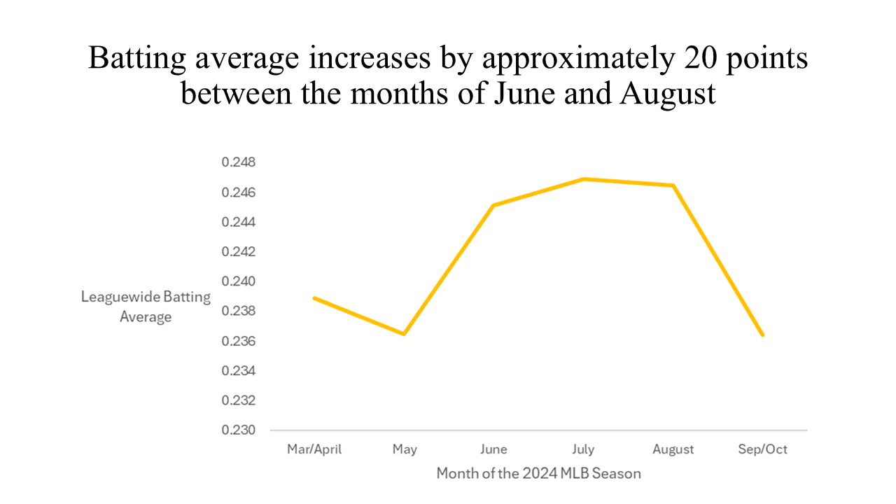
Launch angle has become a key metric in modern baseball analytics. It affects whether a ball becomes a grounder, line drive, fly ball, or home run. By analyzing the distribution of launch angles, we can identify league-wide hitting tendencies and strategies. In Excel, we grouped all recorded launch angles into intervals and created a histogram to visualize the results. Most launch angles clustered between -3° and 27°, suggesting a strong preference for line drives and moderate fly balls.
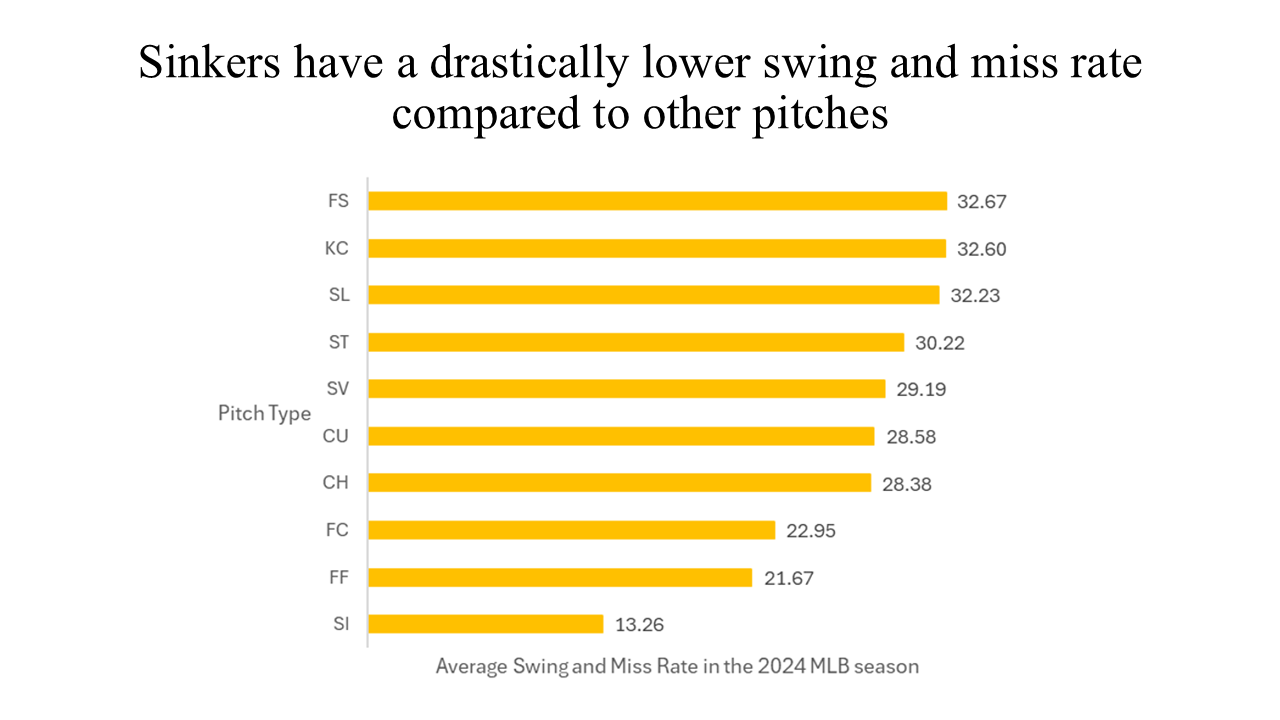
This question investigates which pitch types are most effective at generating swings and misses — a direct indicator of a pitcher’s ability to deceive or overpower hitters. We found this question valuable because it can guide pitch development for players who struggle to get strikeouts. To answer it, we created a Pivot Table in Excel to group data by pitch type and calculated the average swing-and-miss percentage. We then built a horizontal bar chart and sorted it from highest to lowest. Data labels were added to clearly display the swing-and-miss percentage for each pitch type.